Fragmentation is the core pain
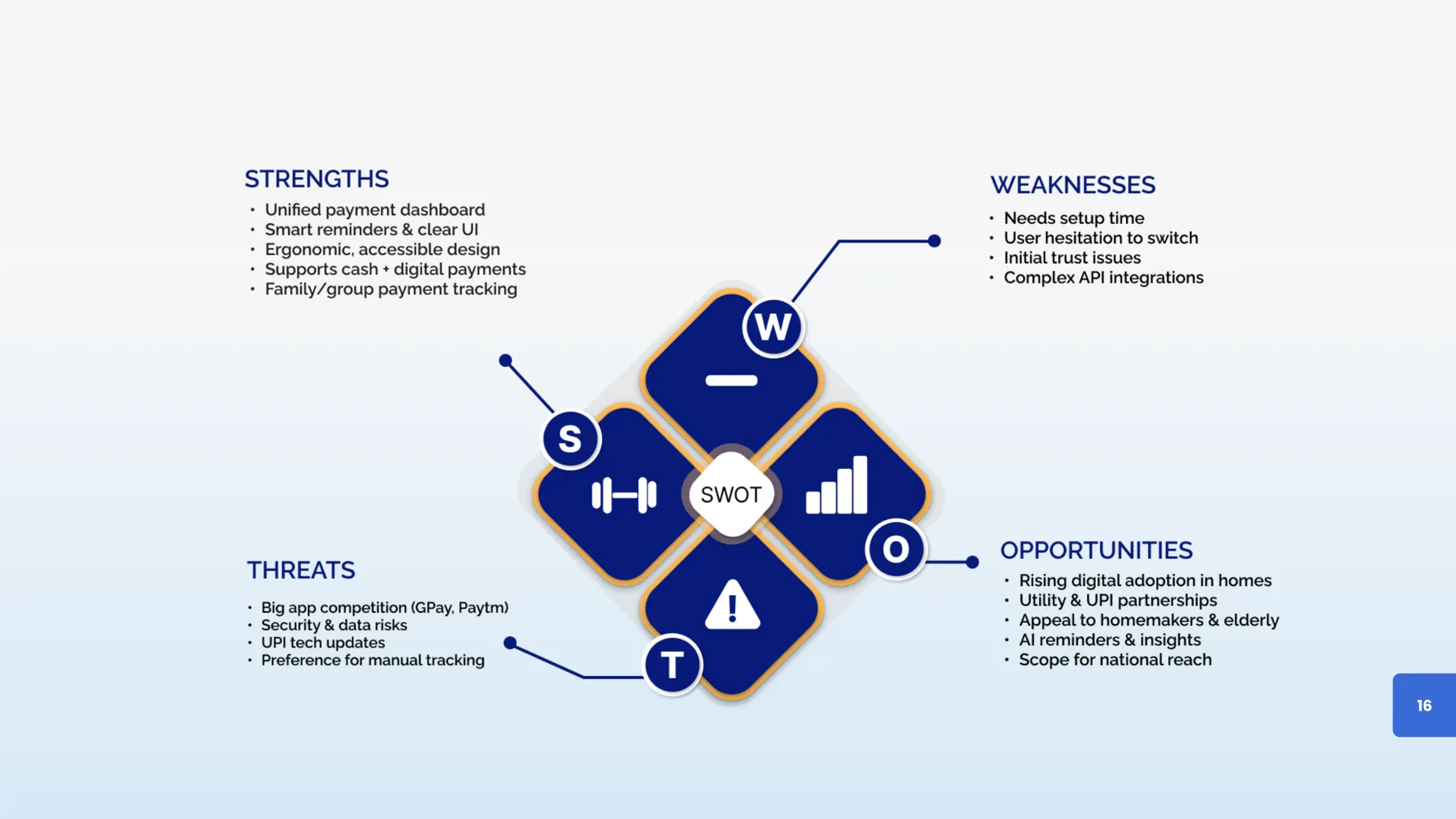
The survey’s top complaints were no combined view of bills and keeping track of dates. Top requests: automatic reminders and one view of everything.
One app for every household bill, designed to cut the cognitive load of paying on time.
Indian households pay rent, utilities, tuition, subscriptions and staff across several UPI apps, reminders and notebooks. Nobody has one view of what’s due.
Payment tools aren’t ergonomically optimised for multi-bill household use: visual strain, cognitive overload, inconsistent flows and accessibility barriers, especially for older users.
The survey’s top complaints were no combined view of bills and keeping track of dates. Top requests: automatic reminders and one view of everything.
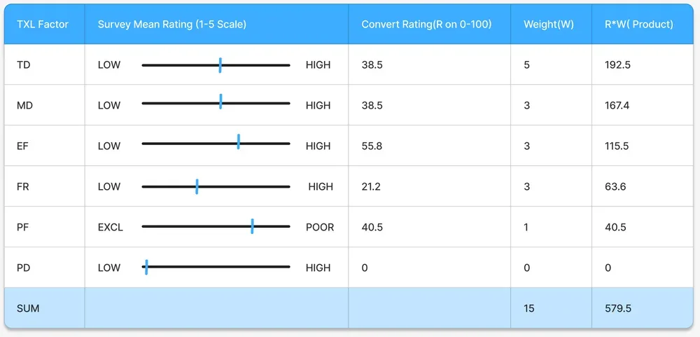
In the NASA-TLX analysis, temporal demand carried the highest weight. The stress is about deadlines, not the payment itself.
Working parents, homemakers, elders and young adults need different things: speed, reminders, larger type and voice, or analytics.
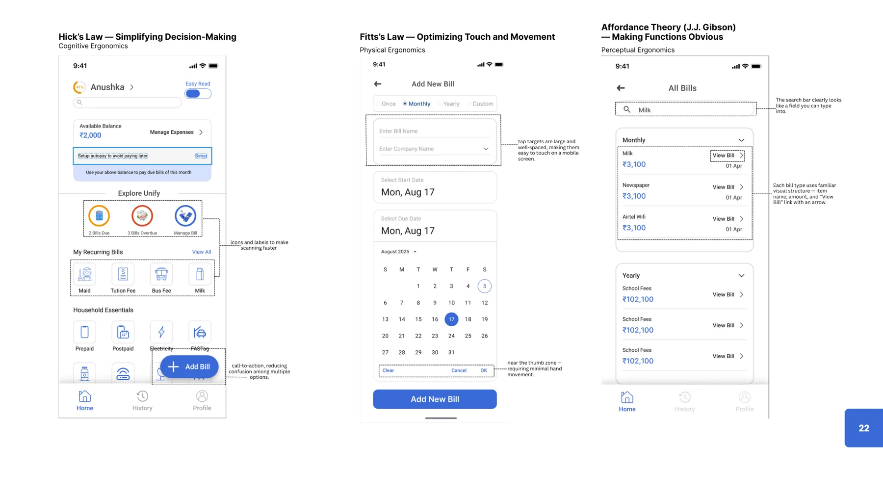
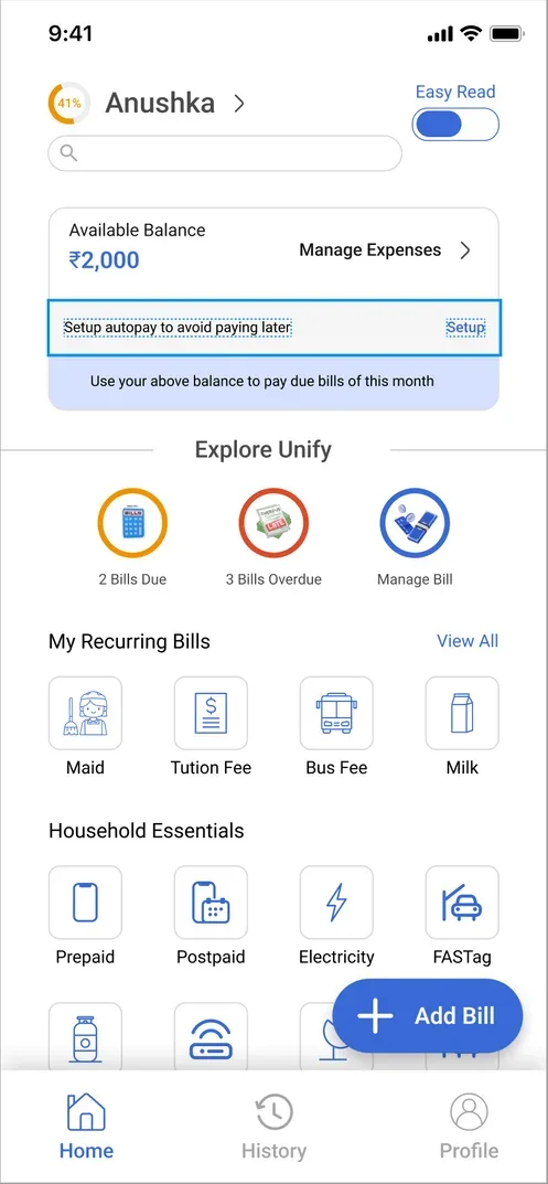
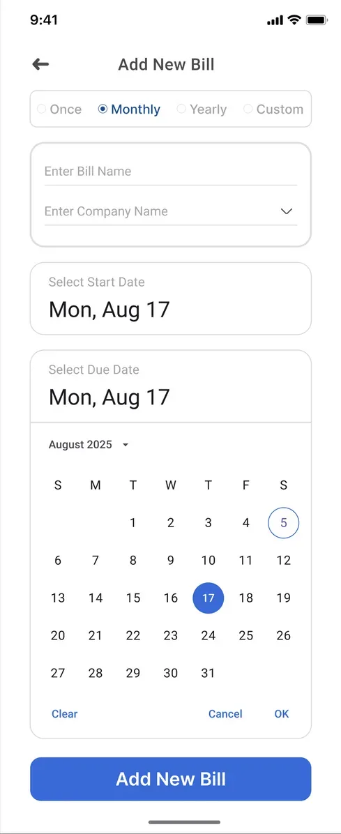
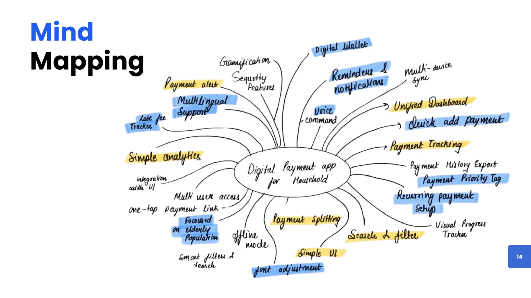
A single app for fixed and irregular bills, with UPI one-tap pay, auto-pay for subscriptions and smart reminders, designed with Hick’s law, Fitts’s law and clear affordances.
Measuring workload with NASA-TLX turned a vague “payments are stressful” into a specific design target: reduce time pressure first.
We designed for four user types, each with a different ergonomic need.
From the user study: difficulty managing many payments, no central system, missed or late payments, high mental load, dependence on several apps, no shared tracking in families, limited accessibility and language support, no expense insight, and privacy worries about sharing details.
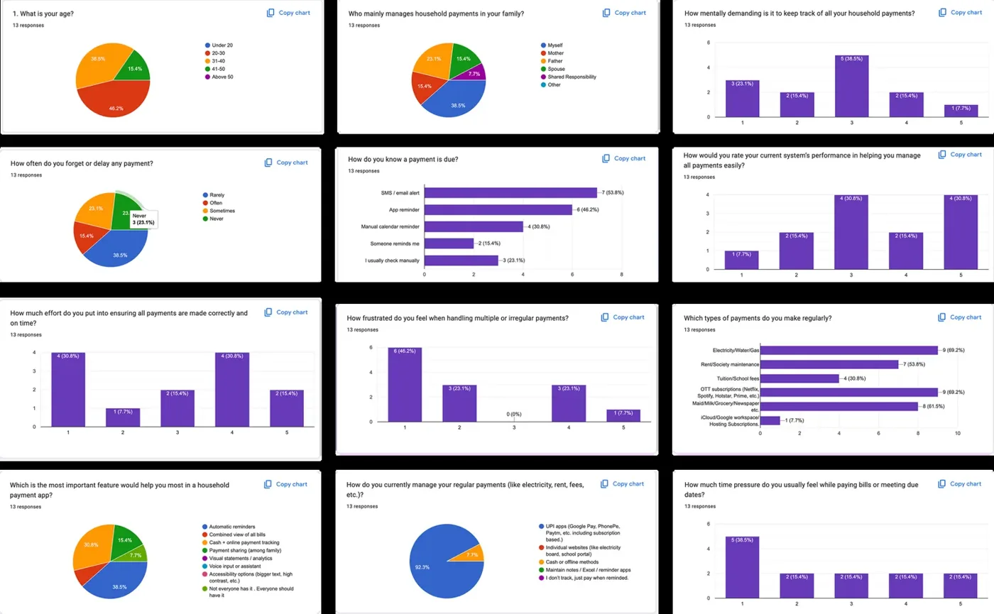
We adapted NASA-TLX to household payments and weighted six factors through pair-wise comparison. The weighted workload came out at 38.6/100. Time pressure carried the most weight, followed by effort, mental demand and frustration. So the design target was clear: cut temporal demand with automation, and cut effort by ending fragmentation.
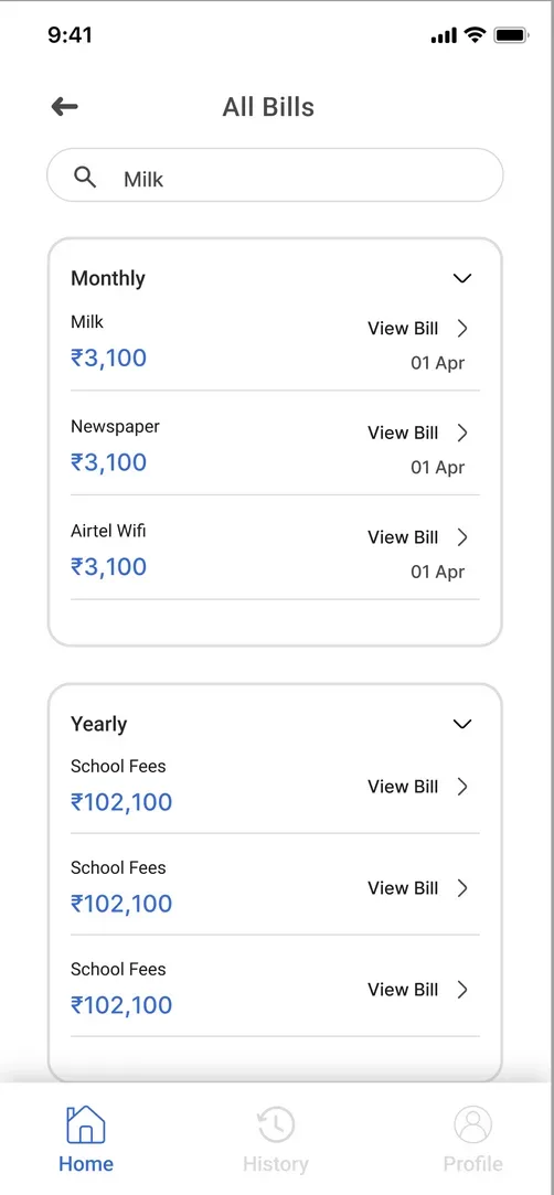
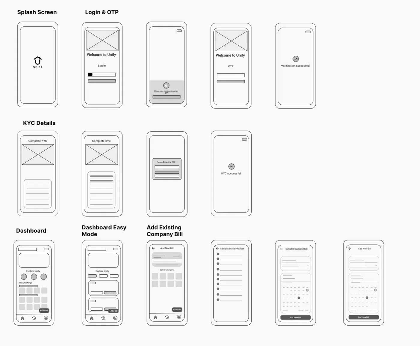
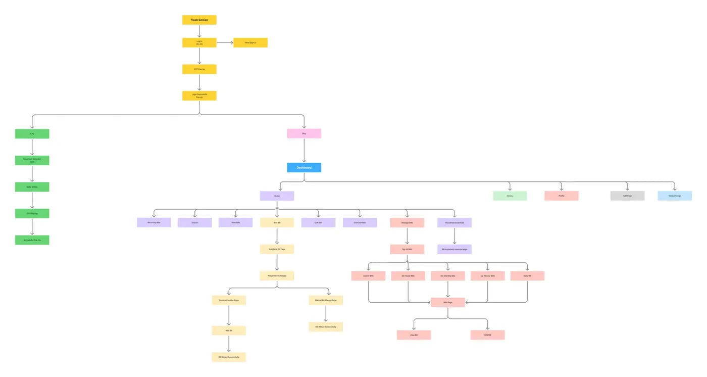
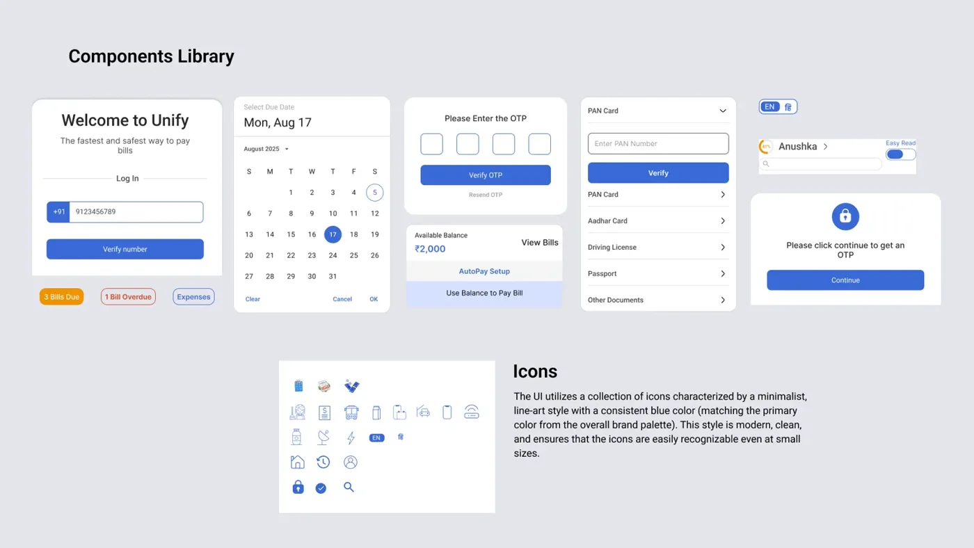
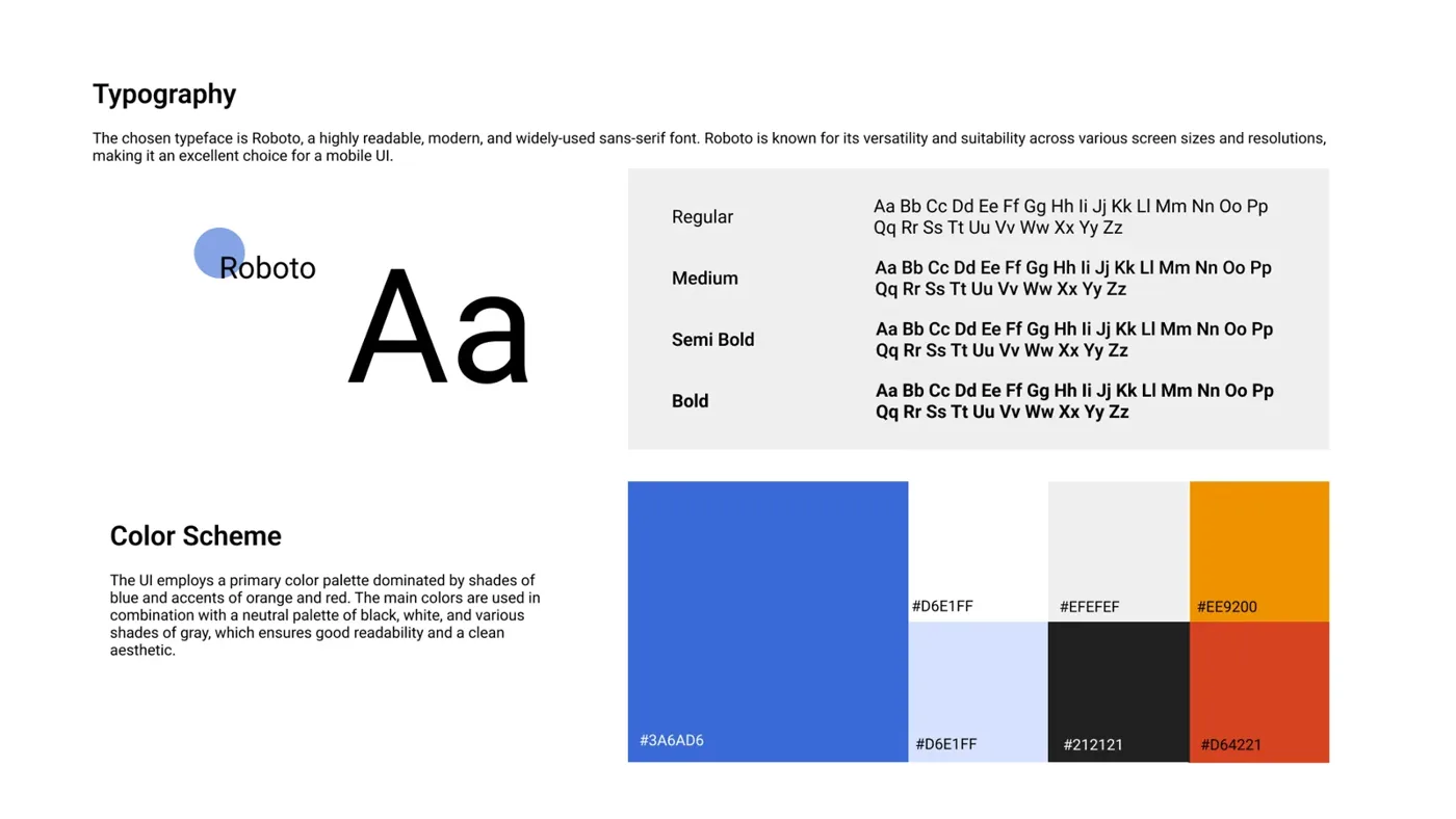
Low-fidelity wireframes set the flows (splash, login, OTP, dashboard, add bill), then an information architecture, a component library, Roboto type and a blue-led colour scheme.
Each screen was checked against three ideas.