PrologueOne meeting, six tools

The meeting is the product.

A financial advisor’s real work happens before, during and after a 45-minute client call, scattered across video, email, a CRM, planning software and e-signatures. MERG pulls it into one place. I was the only designer on it.
My roleSole product designer · flows, UI, part of the design system
Worked withThe CTO of Aphelia Innovations, and the client in the US
TimelineJan – Dec 2022 · three major sprints
OutcomeMVP designed and built; paused when the client’s funding ended
Video callEmail · attachmentSalesforceMoneyGuideProDocuSignCalendarMERG · Client review
MERG in-meeting screen: agenda, shared file, video and notes in one window
“One sec, let me find that file…”
Before: one tool per jobAfter: one meeting room
01The brief, and what we didn’t have

Build a SaaS from scratch. Skip the research.

LetsMerg, a US startup founded by a financial advisor, wanted one hub where advisors, firms and clients could meet on video, share documents, plan and follow up. Aphelia Innovations built it. I designed it, working directly with our CTO and taking feedback from the client every sprint.

1designer: me, from flows to UI to components
0budget for user research or usability testing
3major sprints to reach an MVP
US ↔ INa client on the other side of the world, so feedback often arrived overnight
Decision 0 · the honest one

No users to talk to. What stands in for research?

I didn’t want to pretend we had a research phase. I wanted the closest real signal we could get, and to be explicit about its blind spots.

A
Push for a research phase firstThe right instinct, but no budget and a fixed MVP date. It would have stalled the project.
B
Design from our own assumptionsFast, but our team’s idea of wealth management isn’t evidence.
✓
Triangulate: the founder, the market, the CTOThe founder is an advisor himself, so he was our proxy user. A competitor audit showed what the market already gets right. Every sprint, the CTO checked feasibility.
GainReal domain knowledge from day one, and decisions that could ship.
CostOne advisor’s voice. Clients, the other half of every meeting, were never asked directly.
02Six roles, one product

The hardest screen wasn’t a screen.

Before drawing anything, I had to untangle who MERG was for. Firms with their own admins and advisors. Independent advisors who are their own firm. Clients who stay for years, and guests who join a single call. Every flow forked six ways. Pick a role:

Firms

Independent

Clients of an advisor

Decision · structure

One product, six permission sets, and the firm’s name on top.

Advisors sell trust, so a client should feel they’re meeting their firm, not a software vendor.

A
Separate apps for advisors and clientsSimpler permissions, but two products to design, build and keep in sync, for an MVP.
✓
One app, role-based views, white-labelledThe dashboard header shows the firm (e.g. “Strategic Advisory Partners”), and invitations say “Powered by Merg”.
✓
Invite-first onboarding; guests need no accountCompany advisors and regular clients join from an invitation. Attendees join one meeting with a one-time password.
GainOne design system, and a firm-branded experience clients can trust.
CostEvery screen needed a “who’s looking?” check: 88 settings screens alone.
03Learning from the market

What the giants do, and what they skip.

With no users to interview, the competitor audit was our best evidence. I studied three platforms advisors and investors already know, looking for what to borrow and what to refuse.

Robo-advice

Betterment

Technology-led, goal-based advice with a friendly interface.

BorrowedGoal-based clarity and a calm, approachable UI for money topics.
Asset management

Vanguard

Huge market share, with digital advisory focused on portfolios and low fees.

BorrowedPlain-language framing of portfolios and plans.
Retirement plans

Empower

Retirement planning inside employer plans, with built-in video conferencing.

BorrowedVideo built into the product, not bolted on.

The gap: nobody owned the whole meeting.

Video, documents, CRM context and follow-ups each lived somewhere else. That became the brief inside the brief: design the meeting, start to finish.

Our wedge
04Before, during, after

Designing one meeting, in three acts.

I organised the product around the lifecycle of a single client meeting. Each act answers a moment where an advisor would otherwise switch tools, or a client would feel left out.

Act 1 · Before the meeting

Preparation lives inside the meeting, not in an email thread.

The meeting is an object

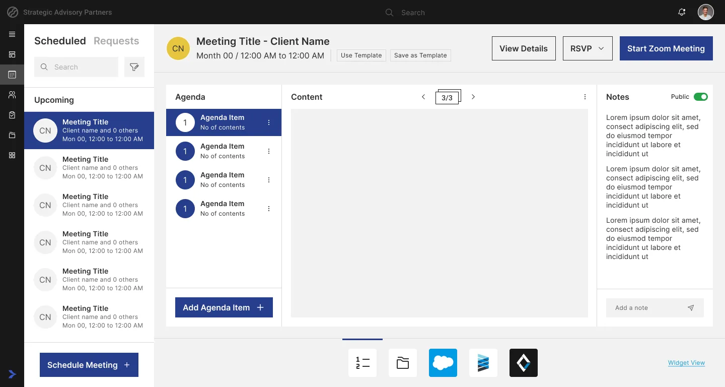
Each scheduled meeting carries its own agenda, content for every agenda item, shared documents and notes. The client sees what’s coming before they join.
  • Agenda items with attached files and pages
  • “Use template / Save as template” for recurring reviews
  • Clients request meetings; advisors schedule them
Why: document delivery, presentation and storage was one of the founder’s core requirements. Attaching files to the meeting means nobody hunts for them mid-call.
Click through “Before” ↗
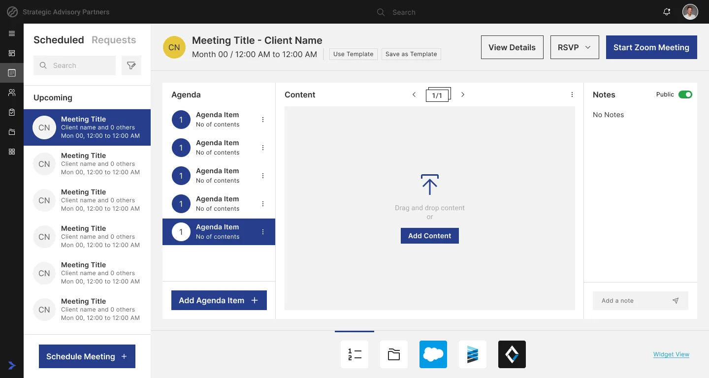
Scheduled · Agenda
Scheduled meeting with an agenda list, content preview and notes

Adding content to an agenda item

Drag-and-drop upload sits right where the advisor is thinking, next to the agenda item it belongs to, with the advisor’s integrated tools one click away.
Agenda · Add content
Adding content to an agenda item with a drag-and-drop area
Act 2 · During the meeting

Nobody should hear “one sec, I’m switching screens”.

A waiting room that isn’t empty

Clients arrive to an announcement banner (“pushed back by 10 minutes”), the agenda, documents and pending action items. There are even refreshment and entertainment cards, so waiting doesn’t feel like being forgotten.
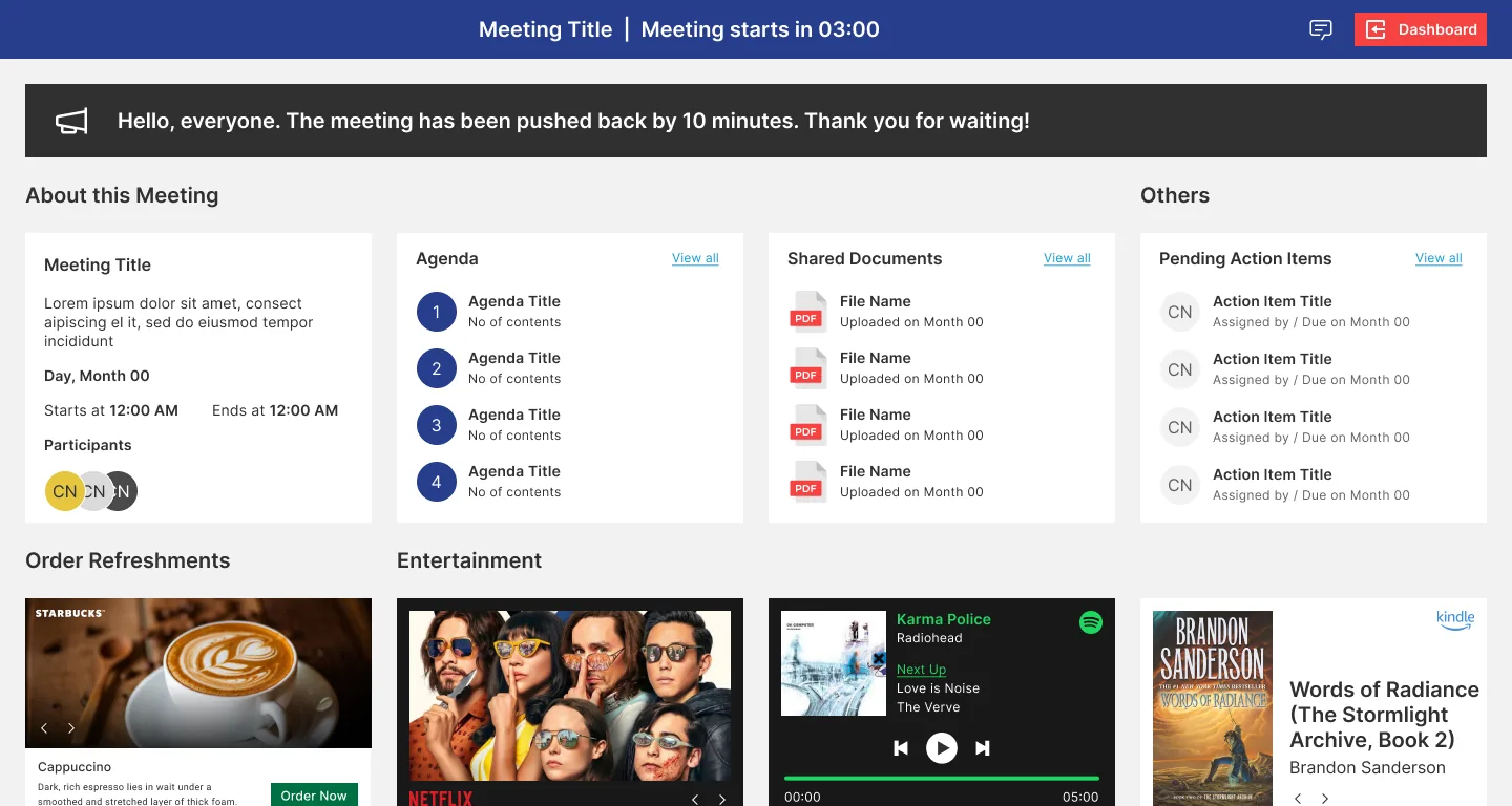
Empathy: for a client, money conversations are already tense. A blank “waiting for host” screen makes it worse.
Waiting room
Waiting room with an announcement, meeting details, agenda, shared documents and refreshment options

Everything on one canvas

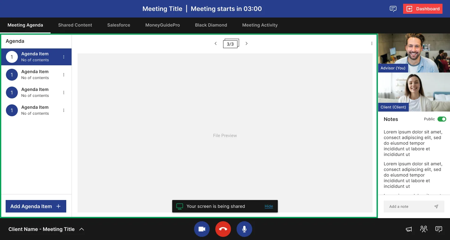
Agenda on the left, the shared file in the middle, video and notes on the right. The advisor’s tools (Salesforce, MoneyGuidePro, Black Diamond) are tabs in the same room.

Decision: tools as in-meeting tabs instead of screen-sharing separate windows. The client keeps context, and the advisor keeps eye contact.

Notes have a Public / Private switch, so advisors can share takeaways without exposing internal thoughts.

Click through “During” ↗
In-meeting · Agenda
In-meeting screen with agenda, file preview, video tiles and notes

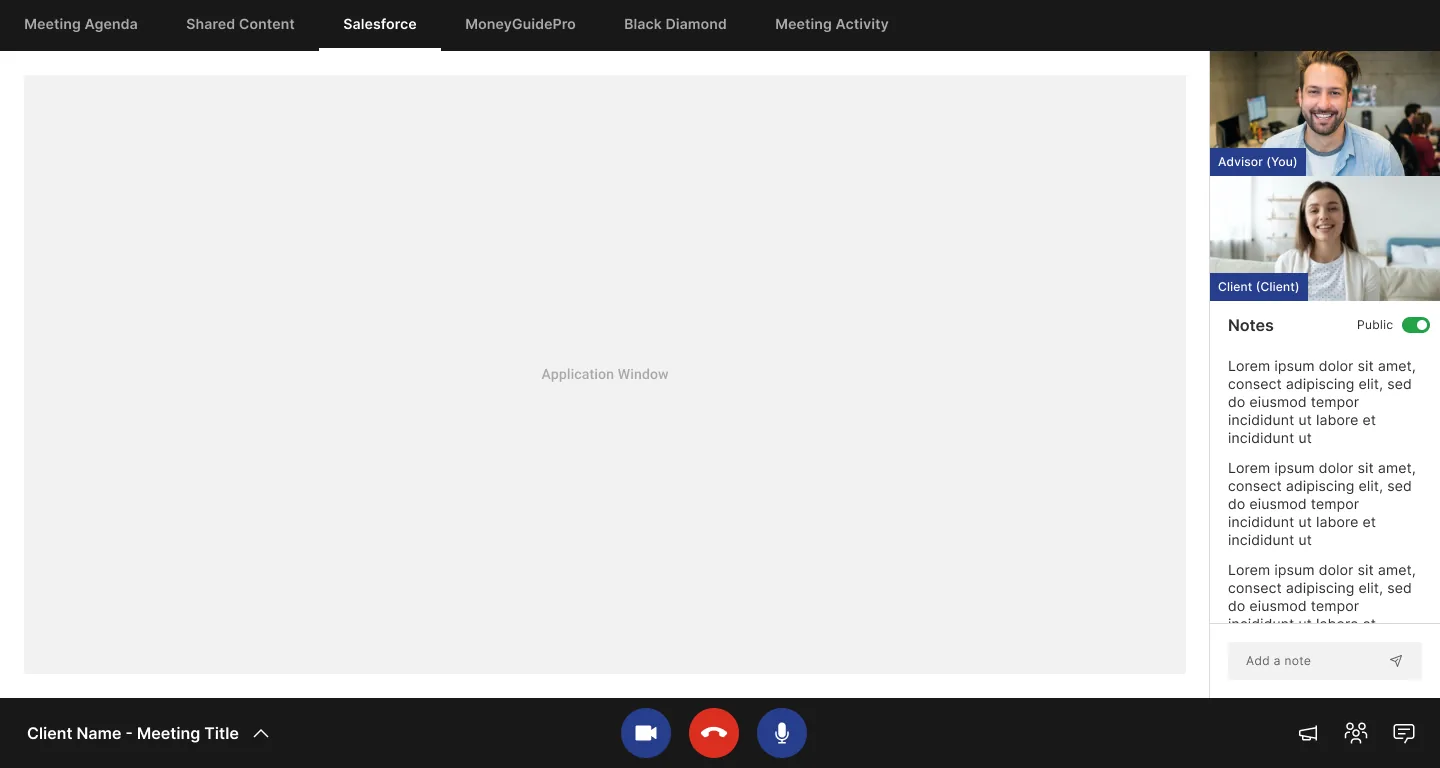
The CRM, inside the call

Switching to the Salesforce tab keeps the video and notes in place. The meeting never leaves the room.

In-meeting · Salesforce
In-meeting Salesforce tab with video and notes still visible
Act 3 · After the meeting

The meeting ends. The work doesn’t.

A rating that asks the right follow-up

After the call, a five-star rating. A low score expands into specific issues (couldn’t hear, video lagging), so feedback is actionable rather than just a number.
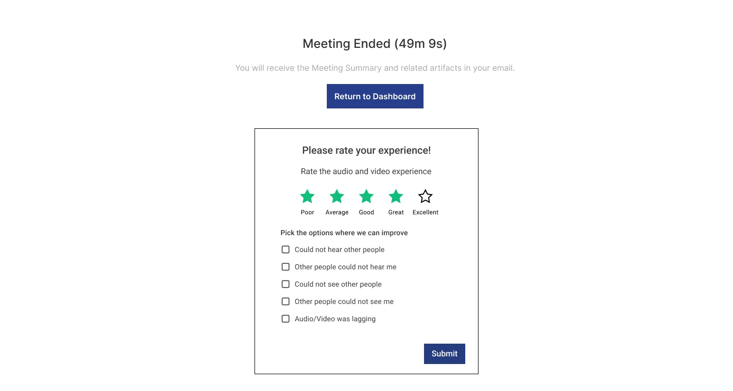
Post-meeting review
Meeting ended screen with an expanded rating checklist

Approvals without email ping-pong

Action items collect what was promised: shared content, document approvals with Approve / Reject, and DocuSign envelopes, all tied back to the meeting and the client.
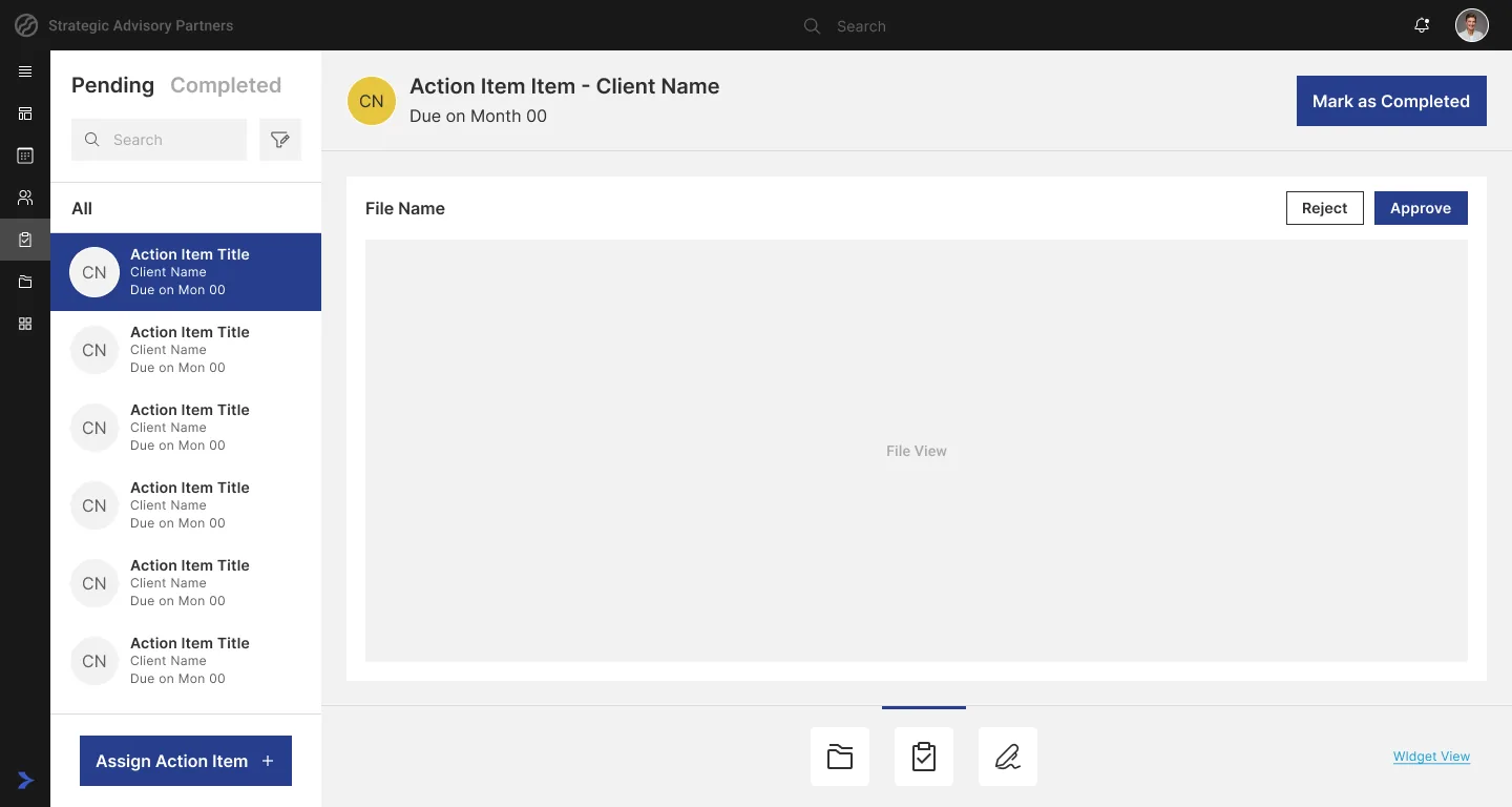
Decision: approvals live in the app, not the inbox, so nothing gets lost between calls.
Click through “After” ↗
Action items · Approval
Action items with a document approval preview and approve or reject buttons
05The dashboard, iterated

One home screen, every situation.

The dashboard went through several rounds with the client. No usability lab: each round came from his reviews and from design principles I could defend. Switch between the states I designed:
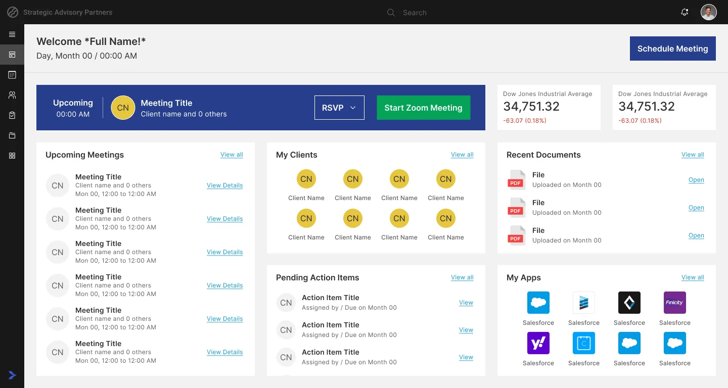
Dashboard · Advisor
Advisor dashboard
Order by frequencyWidgets are ordered by how often an advisor needs them, to keep cognitive load low.
Make the next meeting popThe upcoming meeting sits in a navy band (the Von Restorff effect), with RSVP and Start right there.
Design the empty days“No upcoming meeting” and “No assigned advisor” got their own states instead of blank widgets.
06The system underneath

229 screens only stay coherent with a system.

I was responsible for part of MERG’s design system. With one designer and three sprints, I standardised what repeats most, first. These are the real usage counts in the final file:

Modal
229
Status
133
Popups
103
Overflow menu
36
Side navigation
18
Avatar variants
12

Instances counted on the prototype page of the final Figma file. Popups combine the main, search, chat, participants and dashboard variants.

NavyPrimary actions
SkyLinks, info
YellowAvatars, focus
GreenStart, success
Welcome, AdvisorInter 24 Medium
Upcoming MeetingsInter 16 Semi Bold
Meeting TitleInter 14 Semi Bold
Client name and 2 others · Mon, 12:00Inter 12 Regular
CNCNCNANAN3 sizes × 4 colours = 12 variants
No upcoming meetingA designed edge case, not a blank widget
No assigned advisorIndependent clients still get a useful home
EpilogueIt never launched

The MVP was built. Then the funding ran out.

After the MVP, the client couldn’t fund the next phase, so MERG never reached real users. There are no usage numbers to show. What’s left is the thinking, and what I’d do differently.

I’d defend

  • Designing around the meeting lifecycle, not around features
  • Tools as in-meeting tabs
  • White-labelling: advisors sell trust, not software

I’d change

  • Insist on five real advisor and client conversations, even unpaid
  • Test the in-meeting screen with a client, not only the founder
  • Simplify the dashboard: it carried too many widgets for a first release

What it taught me

  • A client can be a great proxy user, but never the only one
  • Saying “we didn’t test this” is more credible than a made-up number
  • Systems are how one designer scales to 229 screens

“Our collaboration with you all has been nothing short of exceptional… Unfortunately, the VCC web application project did not go live as planned… we encountered unforeseen financial issues that ultimately prevented the project from moving forward.”

MBMark Brooks · Founder, LetsMerg, Inc.
Product design by Pradyumn Yadav at Aphelia InnovationsClient: LetsMerg, Inc. (US)← Back to all work
Next case study

Tenant Services

Property-tech · Associate designer · 2023 · NDA

A bilingual Korean and English platform for an office tower: design system, localization and design QA.

Read the case study