One product. Two languages, two screen sizes.
Tenants of a premium office tower needed one place to book amenities, register visitors and raise requests, in Korean and English, on desktop and phone. I was one of three designers. My part: the design system, Korean localization, the mobile versions, the screen-to-screen logic, developer handoff and design QA.
Toggle the language: same component, different font, size, line height and length. Recreated for the NDA.
A building’s front desk, turned into software.
The client wanted tenants to book lounges, meeting rooms and the gym, register visitors and report problems online, in Korean and English, with an admin side to approve requests.
Screen counts are for the whole team’s file, not just my screens. Requirements came from the client through business development.
Four hundred screens only stay consistent with a system.
I built the design system in Figma: tokens for colour, type and spacing, and components with every state. With two languages and two sizes to cover, every component had to behave in all four combinations.
How often each component is reused across the final file (instances counted on the main page).
Breadcrumb token
Tabs
Inputs · default, focus, error, disabled
Buttons · primary, secondary, disabled
One component set with language variants, not two separate libraries.
Korean text needed a different font and size. The question was where that difference should live.
Translation is copy. Localization is layout.
A Korean designer supplied the Korean text. My job was to make every screen work with it: Korean script needs its own font, and it sits differently in size, line height and spacing than the English it replaced.
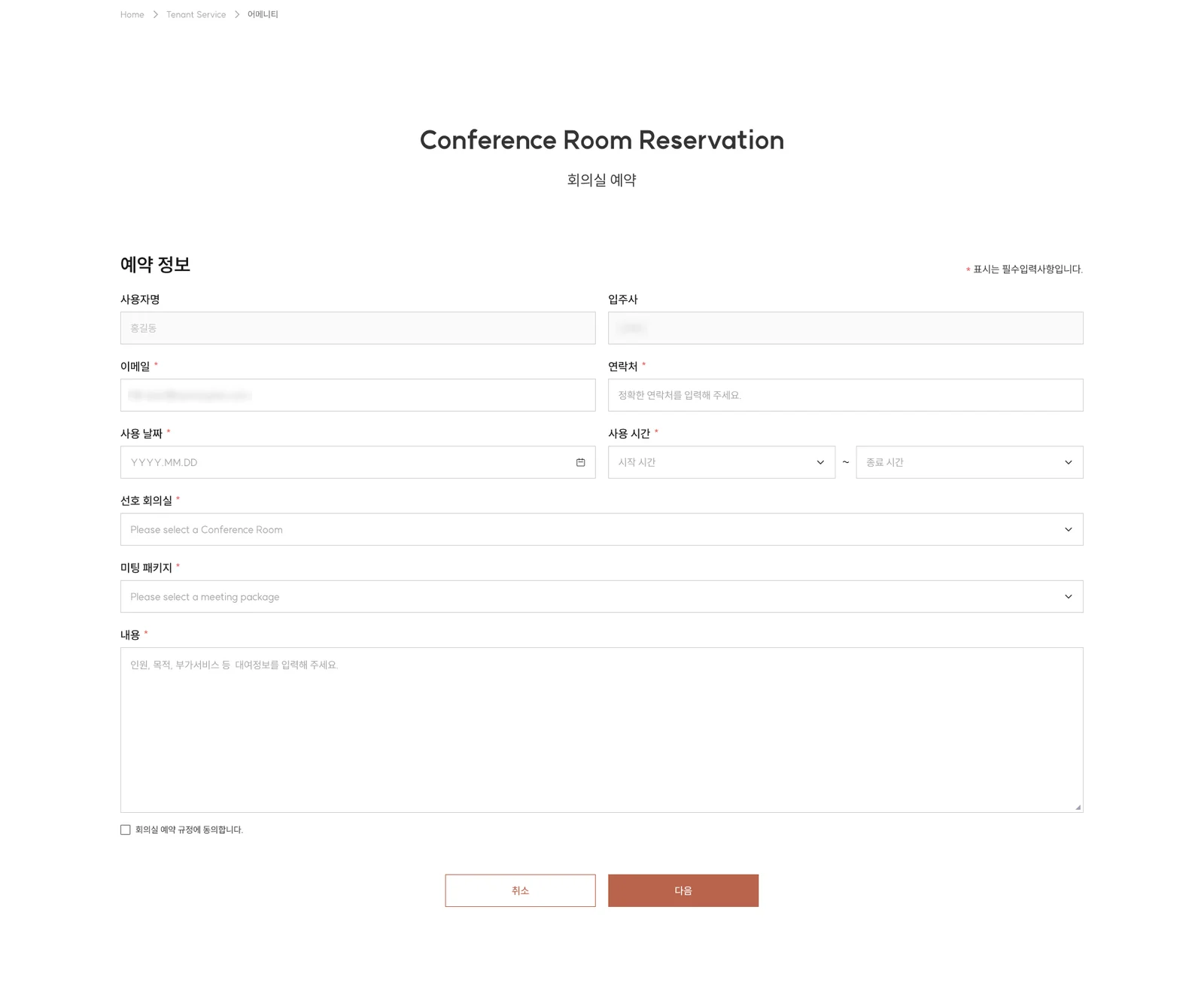
Original screen. Client branding, imagery, tenant names and e-mail domains are cropped or blurred.
Same booking, one thumb.
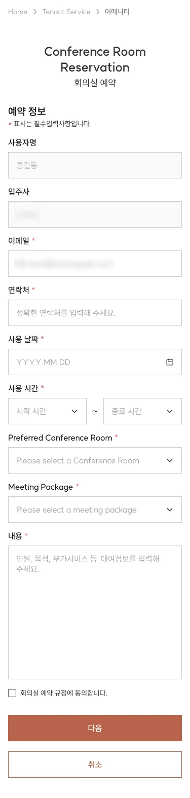
I created the mobile versions of the web screens. A form that fits in two neat columns on a 1920 px screen has to become one comfortable column on a 375 px phone, without losing any field, rule or state.
Which tap opens what, written down.
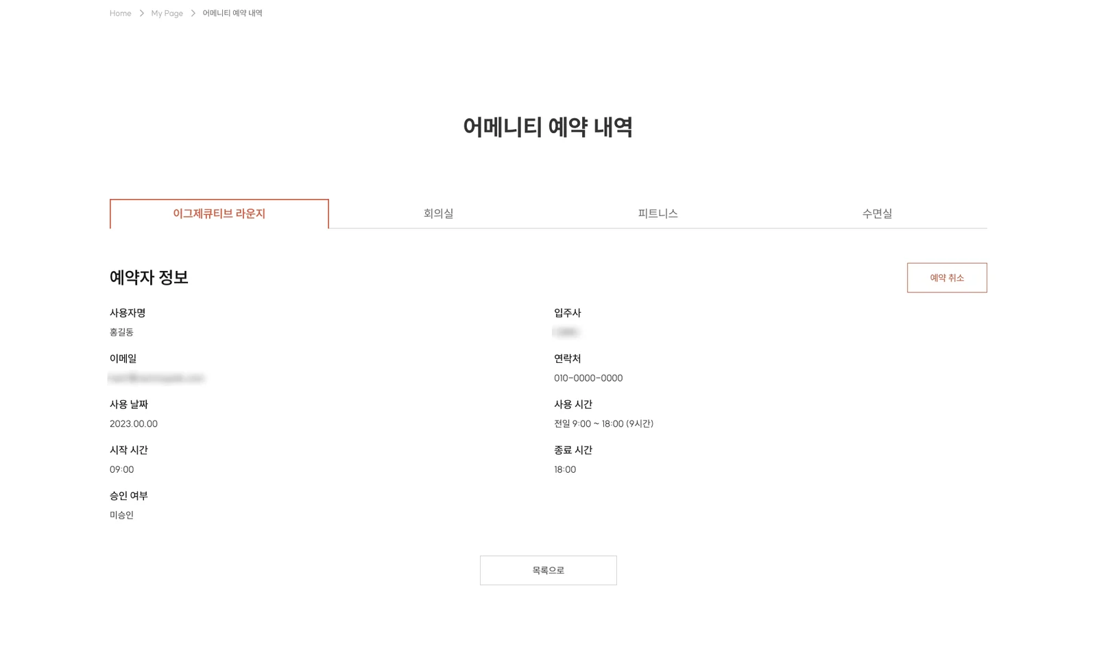
Screens alone don’t tell a developer what happens between them. I mapped the logic: which screen opens after which, what each button leads to, and what happens when something is missing or still waiting for approval. Every screen got a number, and mobile screens mirror it with an M.
Validation states documented in the file. Each one needed a message, a position and a rule for when it clears.
The design isn’t done until the build matches it.
I walked the developers through the screens and the logic map, answered their questions during the build, and then did post-development design QA by hand: putting each built screen next to its design and checking them line by line.
Knowledge transfer
Walked developers through each flow: screen numbers, states, the logic between screens and the mobile rules.
Questions during the build
Developers came back to the design team with queries and edge cases while they built.
Manual design QA
Compared every built screen with its design, in both languages and both sizes, and reported the differences.
Translated from the Korean notes kept beside each screen. The file also holds 111 “check notes”, the functional specs each screen was designed against.
Not the flashiest project. The one that taught me craft.
I’d keep
- One component set for both languages
- Numbering every screen so design and code speak the same language
- Treating design QA as part of the design
I’d change
- Set Korean type styles on day one, not after the English screens
- Write the logic map before high-fidelity screens, not alongside
- Track QA issues in a shared tracker instead of notes beside screens
What it taught me
- Localization is a layout problem, not a copy problem
- Developers need the logic between screens as much as the screens
- Small mismatches add up; checking the build is where quality is won
Dnerd Studio
Ed-tech web app · Co-founder · 2025 – nowA practice platform for design entrance exams, from a 1:29 AM WhatsApp message to a live product.
Read the case study →